Built from Faith.
Built to Last.
Adventurous Christ-Centered Experiences
Three Logos. One Mark.
We designed a complete logo system for Camp Lone Star — three distinct versions of the mark, each built to serve a different context while maintaining a unified visual identity.
Every Element Has a Purpose.
The Camp Lone Star logo is a theology in visual form. Each element — the star, the trees, the hill — carries specific meaning rooted in the camp's faith and mission.
The Color Palette.
A focused three-color palette — bold, grounded, and intentional. Barn Red leads as the primary brand color, anchored by black and white.
Four Fonts. One Voice.
We specified a complete four-font system — each typeface serving a distinct role in the brand hierarchy, from the expressive display faces down to the legible paragraph fonts.
abcdefghijklmnopqrstuvwxyz
1234567890 !@#$%^&*()
abcdefghijklmnopqrstuvwxyz
1234567890 !@#$%^&*()
abcdefghijklmnopqrstuvwxyz
1234567890 !@#$%^&*()
abcdefghijklmnopqrstuvwxyz
1234567890 !@#$%^&*()
camplonestar.org
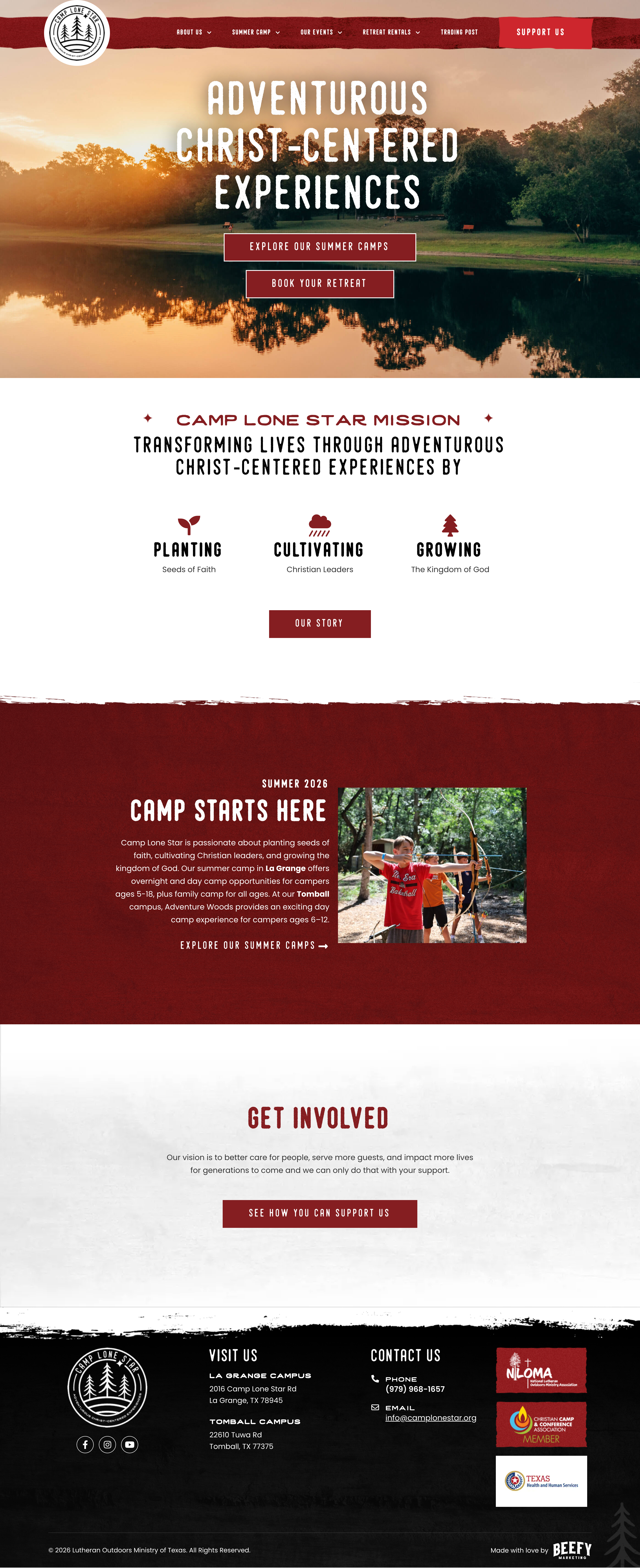
We carried the brand system through to a complete website redesign — built around the camp experience, the two campus locations (La Grange and Tomball/Adventure Woods), and clear conversion paths for summer camp registration, retreat bookings, and donor support.