
Your business needs a website that’s not just functional but also engaging. This means it can be accessed by any device and in any environment. If your website is not accessible, you’re missing out on a huge chunk of your potential audience.
That’s where adaptive web design comes in. The adaptive approach to web design is a way of building websites that work across multiple platforms and devices, ensuring that your content is presented in the best possible way for each user.
It’s not a new concept, but it’s becoming increasingly important as more people use their phones and tablets to browse the web. And if you don’t have an adaptive website, your business is at risk of being left behind.
Let’s look at adaptive web design, its importance, and how you can improve your website.
What Is Adaptive Web Design?
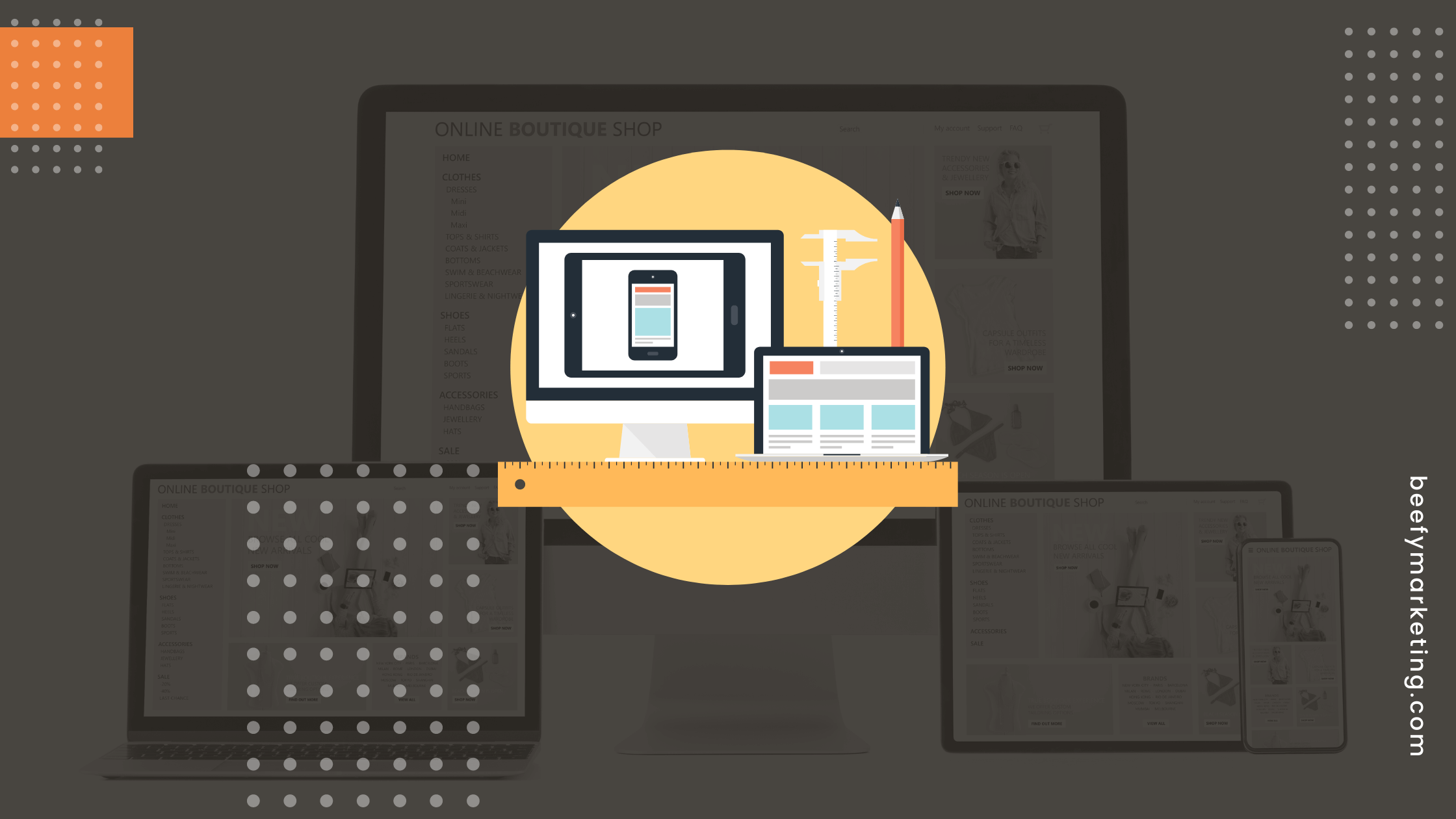
Adaptive web design is a web development technique in which a website’s presentation changes based on the device used to view it. It’s also known as responsive web design (RWD), but the two terms are often used interchangeably.
Adaptive web design differs from responsive web design in that it focuses on all aspects of the experience, including layout, navigation, and content, rather than just aesthetics.
An adaptive site will adjust its layout based on screen size, aspect ratio, and even touch or mouse interaction capabilities. It will also adapt its content to fit the device being used, using different layouts and images on mobile devices than desktop computers. A website with an adaptive web design will look similar across all devices, but the experience will be tailored to each device’s capabilities.
What Are the Benefits of Adaptive Web Design?
Your website should be a one-stop shop for your customers, regardless of their device. If a customer visits your website on their smartphone, they should be able to find what they’re looking for quickly and easily.
So what are some of the benefits of adaptive web design? Here are just a few:
- Websites that adapt themselves to different devices are more likely to be found by search engines like Google.
- They can read everything without having to zoom in and out or scroll around trying to find what they want.
- They’re more user-friendly, allowing visitors to focus on the content of a page rather than how it looks.
- It helps you create a better user experience.
- It saves time because it doesn’t require developers to create multiple versions of the same site.
- It’s easier to maintain and update a website.
- You can make changes once, which will apply across all platforms.
- It’s more cost-effective than creating multiple versions of the same site.
Conclusion
Adaptive web design is a critical aspect of modern website development. It’s not just about ensuring your website looks good on different devices but also about ensuring that it works with the user experience on each device. Your content should be optimized for every screen size, resolution, and orientation. And if it’s not, you risk losing traffic and customers because your website won’t load properly on their devices.
Skip the hassle and headache of creating a website that looks good on every device. Beefy Marketing is the best digital agency in Tomball, TX. We can help you create a website that is optimized for every device and screen size. Our team has years of experience building websites with an adaptive design that looks great no matter your device. Contact us now!
