
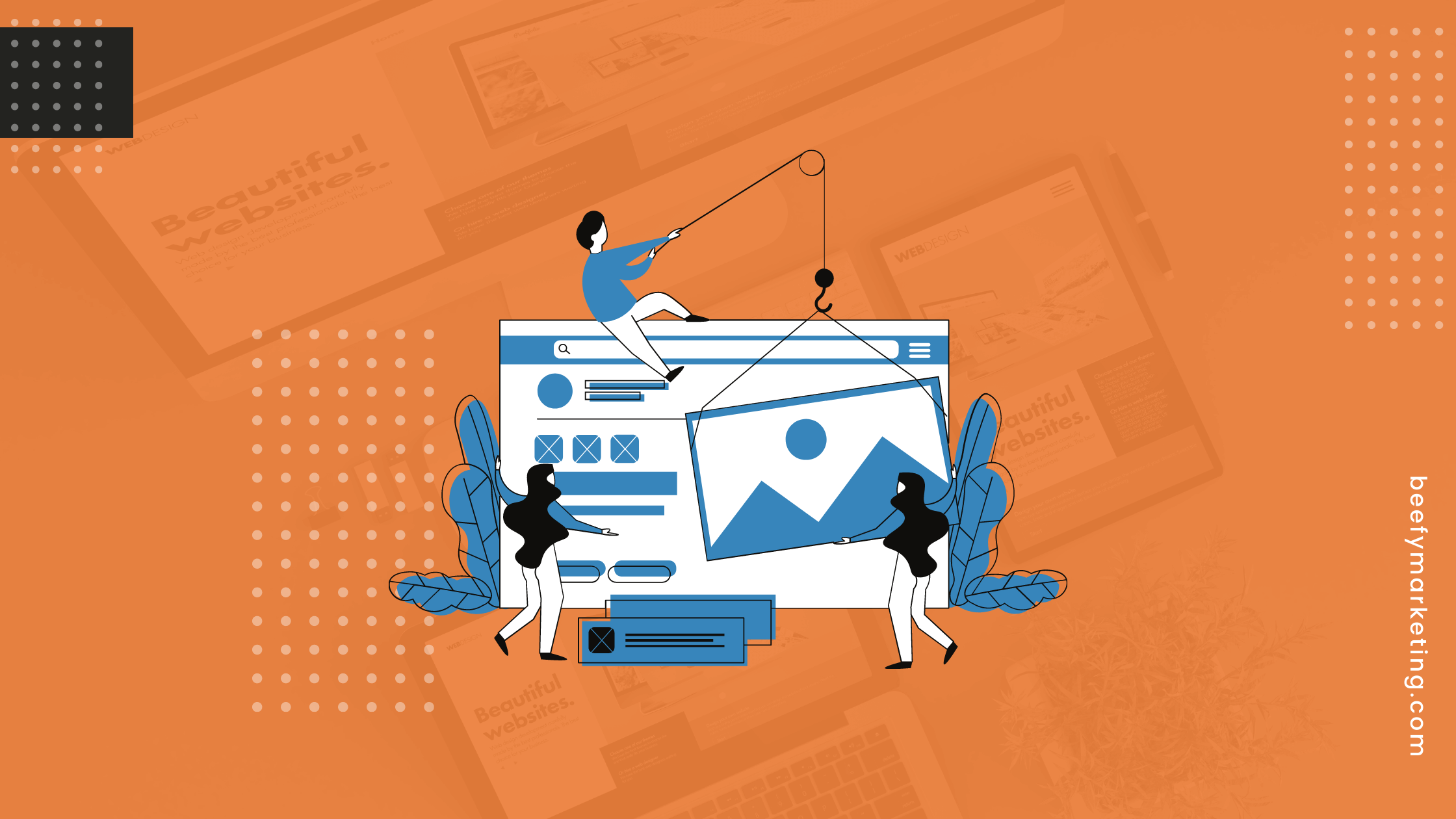
Your website is the face of your business, this is why it is imperative that you make sure it makes a statement. Once it is able to do this you will find that you get more visitors and secure more conversions.
However, while you know that your website must stand out from the competition you may not know how to go about making it do so. With so many websites out there you need to do your best to make a good first impression. You may be wondering how exactly you can accomplish this.
Luckily, there are a few simple techniques that you can use to make your website stand out from the competition. Here are some useful tips that you can use to get your website design looking its absolute best.
1. Develop a Plan
Perhaps the most important thing you need to do is to make a plan. Think of it this way, an architect would never build a house without first laying out the foundation.
Get a clear picture in your mind of where you want everything to be on your website. Don’t worry if you have to change a few of the placements this is perfectly acceptable. Once you have a clear idea of where to begin you can start to fine-tune your plans to suit your needs.
2. Use Social Apps
Your website should not just have great content it should also have social share buttons where people can share your content. These buttons should be strategically placed so that people won’t have a hard time sending your content to their friends or their family, in this way you will increase your website traffic.
It will also help to make your social media page even more popular than they are now. You may be worried that you will have to use a lot of money to put these apps on your website.
The good news is that there are many free apps available so there is no need to break the bank.
3. Make a Bold Statement
As soon as someone gets on your website there should be something that grabs their attention immediately and asks them to do something. Do not waste your header. It’s the first thing that people see when they get on your website.
It should ideally contain a free offer and give people the call-to-action they need to perform in order to redeem the offer. Make sure to use vivid colors that capture attention or even black or white to capture the attention of your visitors.
However, you should not stop there when you write a great piece of content on any of your other pages add a few extras such as a checklist, worksheet, or a signup form for a webinar. Always over-deliver on the value that you offer, this will keep your audience coming back.
4. The Length of Your Pages is Important
Make your home page as long as possible. This is because when someone visits your website they do so because they want information about a topic.
The first page of your website should contain a lot of information. It should tell the visitor exactly what your brand is about in detail and how you can help them.
Bear in mind too that many times when people enter your website from other pages they pause for a minute to check out your homepage to see who you are and what you care about. Make sure that they’re not left with any questions after visiting there.
Remember too that the longer the page the more likely it is that people will spend time on it and this decreases your bounce rate.
5. Use Faces
Whether they know it or not people love to look at faces. When there is a face connected to a brand, it looks more human and people are more likely to interact with the page.
When people go on your website they should see people smiling. If you have an offer you can have a picture of someone looking in the direction of the call to action.
Better yet you should have them pointing or making a gesture towards your offer. This is the best way to ensure that people pay attention and do what you want them to do on your website.
6. Don’t focus on Too Many Things
You should be careful not to focus on too many things at once. Make your website laser targeted and you will be better able to reach your goals.
Stick to one major goal for every page of your website. Make sure that you do not put too many items on your navigation bar as well. One call to action is also enough for every page.
If you use forms you should limit the fields that you use. Although it may be tempting to try and use many different fields to gain information from those who interact with your website. Resist the temptation because less is always more.
In fact, if you have a signup or popup form it is best to limit your fields to “Name” and “Email”, some website owners even limit it to just the email field.
The fewer hoops people have to go through to get an offer the more co-operative they will be. If you want to collect more detailed information in future install chatbots on your site. People like to get instant information and are willing to share more personal details to get it.
Final Web Design Tips
In order to get your website to make a good first impression, you need to make sure that it stands out. The best way to do this is to use a design that is in tune with the needs of your audience.
No matter what kind of business you run it is a good idea to always make a good impression in the top half of your website where there is a header. This area is often referred to as “above the fold”.
Use social media apps, quality content with a good length, and faces as part of your design strategy. If you would like more information on web design, please contact us.
